
BAKEHOUSE APRON AND TOTE
Apron and tote featuring graphics designed for the Bakehouse Art Complex in a letter-shaped bread, which is a nod to the building's history as the first industrial bakery in South Florida.


Photos by Pedro Wazzan, 2022
MEMORIES OF A STREET POET
A calendar inspired on Burton Rosenburgh’s poems from Memories of a Street Poet.


2019
PLAYFUL DOT
Playful Dot is a font inspired by minimal, abstract shapes. The name is derived from the movement of the dot, which is the consistent element that runs throughout the design of each letterform. It is as if the dot is playing or dancing around and interacting within the lines and shapes.


2019
CAN LABEL REFRESH
Refreshed label designed for Graziano’s tomato can in collaboration with Lemon Yellow. Product currently sold at Graziano’s markets.
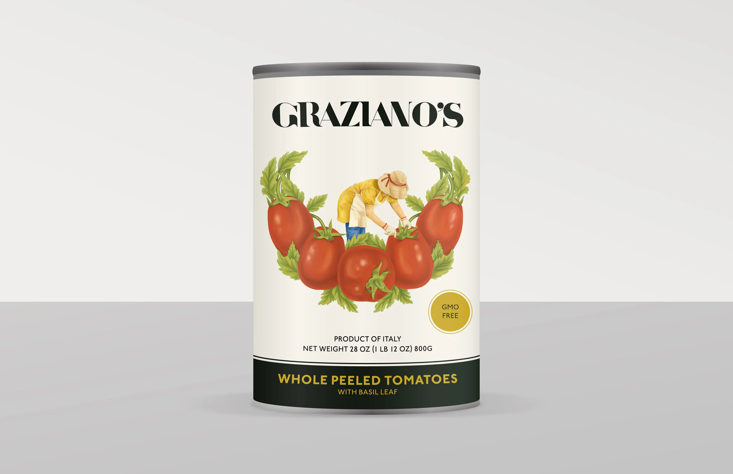


2018
CAROL THE CARROT
Carol The Carrot is a series of packages created for kids with collectible erasers designed for an imaginary company named Reset. Each package was created to not only contain the item in an engaging way but also to educate kids through the use of fun facts placed on the back of each design.


2018
PAPERHUG
Paperhug is an imaginary company that specializes in the production of wrapping paper. The name stands from the action of wrapping, which was metaphorically translated into “a paper hugging a box”. The designs on the wrapping paper form part of a trilogy called Apology. Based on the meaning of the word, the designs work with the idea of putting something back together, the same way as when someone apologizes.


2017
UNSEEN
UNSEEN is a series of 26 photographs that explores the world of typography by trying to find letters in the unseen. The intention is to play with the viewer’s perception by discovering the City of Miami through its windows and reflections. The book functions as a visual comparison between the photos taken and the found fonts.


2017
ACCORDION FOLD BROCHURE


2017
TRI FOLD BROCHURE


2017
TAKE ME TO MIAMI
In looking over the various foods that Miami has to offer, Take Me to Miami decides to show those new to the culture the choices they have when visiting the city. Through the use of postcards, an assortment of typical foods was selected defining the city’s culinary culture. Each postcard offers a unique view of food, giving a taste of variety and originality.


2017
CREATIVE
A triptych that talks about the importance of creativity in life.


2017
FOAM DRESS
Experimenting with materials in the making of clothes.


2015